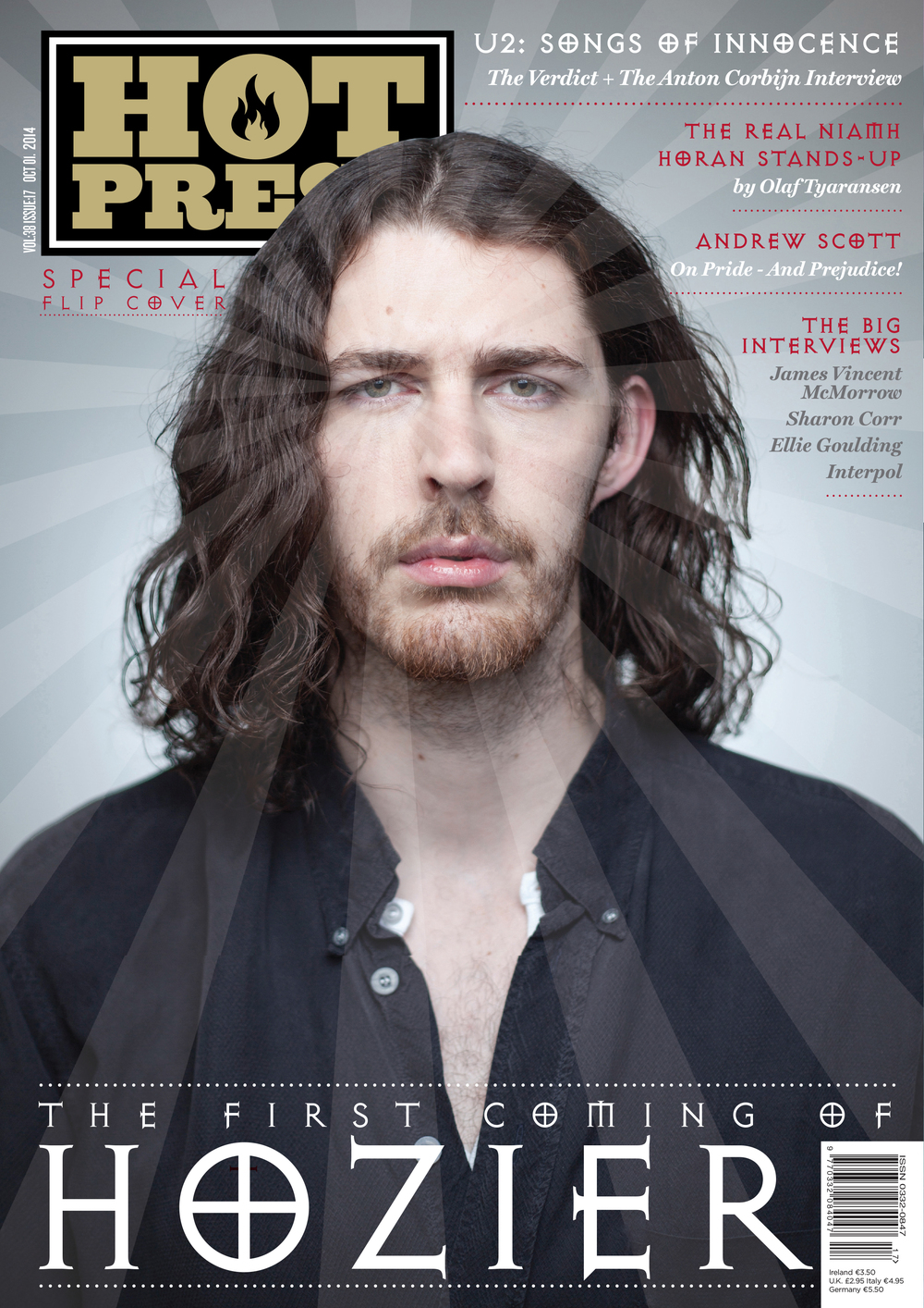
The genre of this magazine is clearly for rock/alternative rock music. Hot Press covers several rock bands and artists, U2 being another example. You can also tell that there's some form of religious element to the music, as the font of 'HOZIER' is quite traditional, and the cover consists of heavenly-like rays along his face. This is in connotation to one of his most popular songs, 'Take Me To Church'. Additionally, you can indicate the genre of this magazine, due to what Andrew-Hozier Byrne is wearing, and his expression. He seems quite edgy, and his overall features leave that sense of a rebellious attire.
Another way the magazine is resembled for its genre, is the 'HOT PRESS' masthead on the top left. It's bold, and the fire in the 'O' is cohesive to the word 'hot', perhaps indicating some of the best alternative rock music in the charts at the moment. The same 'holy' font is on different parts of the coverlines along the cover; such as U2's album: Songs of Innocence. Also on a few of the other rock artists, which draw attention even more to the genre of the music magazine. The colour scheme is quite mixed, although retaining dark shades to maintain the edgy appearance.
The representation of this magazine delivers the same appeal as the genre. Simply because of Andrew's expression, his dark clothing, and the holy effect over his face which brings light to his song, 'Take Me To Church'. His hair is quite shaggy and messy, which delivers on the careless and relaxed type of artist. He doesn't have any effects or edits, conveying that the music is real, with minimal autotune and so on.
I think the audience of this magazine would be a mature group, probably young adults and concert enthusiasts. More specifically, I think fans of rock music would prefer this type of magazine over others, as some of the bands mentioned are specific types of music, rather than just one type. The magazine is also aimed at movie watchers. For example, Hozier is Alternative Rock, U2 is Rock in general, and Andrew Scott is an actor.
The media language of this cover is the same throughout. The photo of Andrew is a medium close-up. The background consists of a simple grey shade. Also, the dark colours of the magazine portray a very serious cover.

No comments:
Post a Comment